Five Revolutionary UI/UX Design Tips to Transform Your Design Skills Overnight
Welcome to an exciting journey into the realm of UI/UX design! Are you someone who dreams of creating apps and websites that captivate users and stand out in a sea of designs? If yes, you're in the perfect spot. In this article, we’ll walk you through five mind-blowing UI/UX design tips that will elevate your design skills to a professional level—almost overnight. These tips are drawn directly from the highly-rated UI/UX Playbook, a trusted guide that has already transformed thousands of users' design journeys with over 6,000 downloads and five-star reviews. Stick around until the end; there’s a massive surprise waiting for you!
The foundation of the UI/UX playbook
Before diving into the tips, let's talk about the UI/UX Playbook. Why do users rave about it? It's a comprehensive resource loaded with practical tips, step-by-step guides, and real-world examples that turn theory into actionable steps. Whether you're a designer, developer, or marketer, the Playbook empowers you to create visually stunning and functional designs that people genuinely love.
But what makes it truly special? It proves that you don’t need a formal design degree or years of experience to excel. By mastering key principles, you can create exceptional user experiences that are intuitive, aesthetic, and impactful.
Are you excited? Let’s get started with the first sensational tip!
Tip #1: Use size, weight, color, and visual cues to differentiate information

Using size and subtle colors ensures clarity
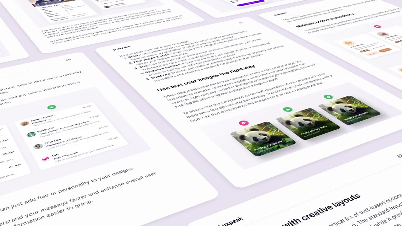
A common rookie mistake in UI design is presenting all information in the same visual format. This often leads to monotonous design and a confusing user experience. Users struggle to identify the most critical information because there is no clear prioritization.
To overcome this, leverage formatting tools like:
- Font weight and size: Use bolder, larger fonts for primary information.
- Colors: Highlight important details with contrasting colors.
- Visual cues: Use icons and symbols to draw quick attention to critical sections.
For instance, in two-column designs that use labels and values, applying colors or alternations in formatting makes it easier for users to differentiate primary and secondary information.
By introducing hierarchy in this way, your design becomes more engaging and intuitive, allowing users to scan and absorb information effortlessly.
Tip #2: Prioritize important information in your layout

Emphasize what matters most to the user
A critical step in UI design is arranging elements based on their importance. Before even starting a design, list the features or data points you need to include. Rank them in order of significance to the user, then reflect this hierarchy in your visual layout.
For example:
- Use size, position, and contrast to highlight key metrics or data.
- Prioritize the content that your audience engages with the most and downplay supplementary elements.
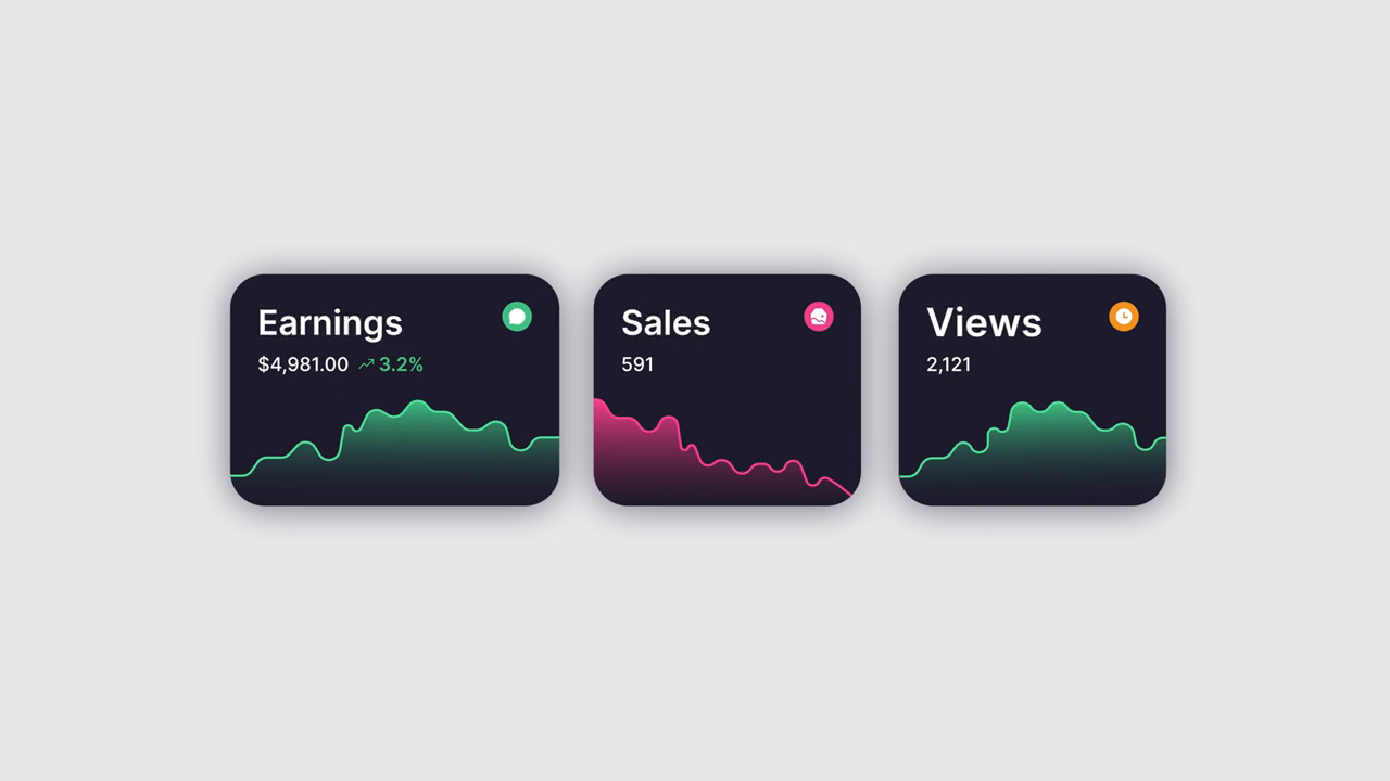
Imagine presenting three metrics—sales, revenue, and views. In an ineffective design, the labels (like "Sales" or "Revenue") are oversized compared to the figures, which distracts users from the actual data. A better design flips the focus, making the metrics themselves (e.g., "591 sales") the most prominent.
This practice helps users understand the information they need quickly and without confusion.
Tip #3: Use soft shadows to enhance professionalism

Soft shadows add depth without overwhelming the design
Shadows play a crucial role in modern UI design, adding depth and realism. However, overusing them or applying harsh shadows can make your design look unpolished and unprofessional.
To perfect your designs, follow these guidelines for shadows:
- Use softer shadows that blend seamlessly into the background.
- Avoid overly dark or sharp shadows, which can make designs look dated.
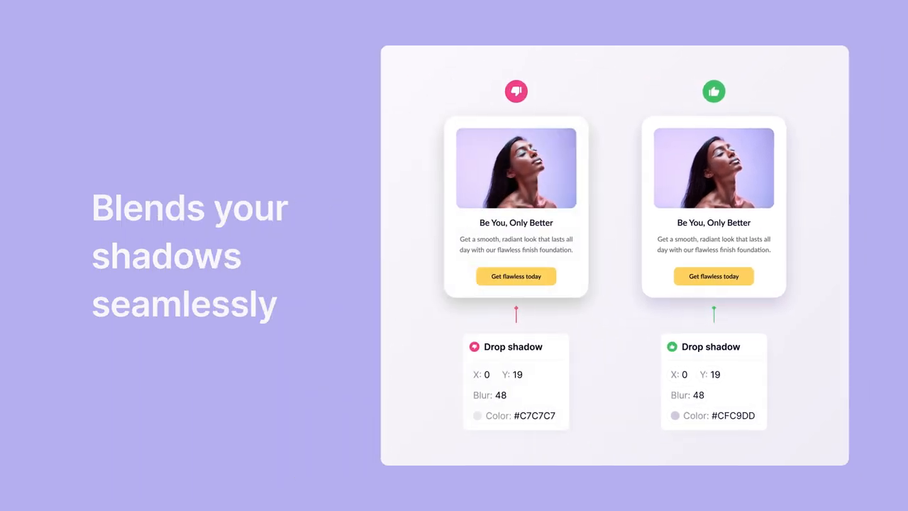
For example, compare two UI cards:
- One features a dark, rough shadow. This draws unnecessary attention to the shadow rather than the content.
- The other uses a soft gradient shadow that enhances the card's presence without dominating the visual hierarchy.
Additionally, you can:
- Match shadow colors to the background tone (e.g., use a purple-toned shadow on a purple background) to create harmonious and aesthetically-pleasing designs.
This small adjustment can elevate the overall quality of your UI designs effortlessly.
Tip #4: Optimize and test product images for better conversions

Well-presented product imagery enhances user trust
Have you ever noticed how some products dominate the market while others struggle despite offering similar value? The difference often boils down to presentation.
Consider these product image optimization steps:
- Use high-resolution imagery that highlights the product’s unique features.
- Employ attractive design principles like matching backgrounds and contrasting layouts.
- Showcase elements that build trust, such as actual product pages or key value propositions.
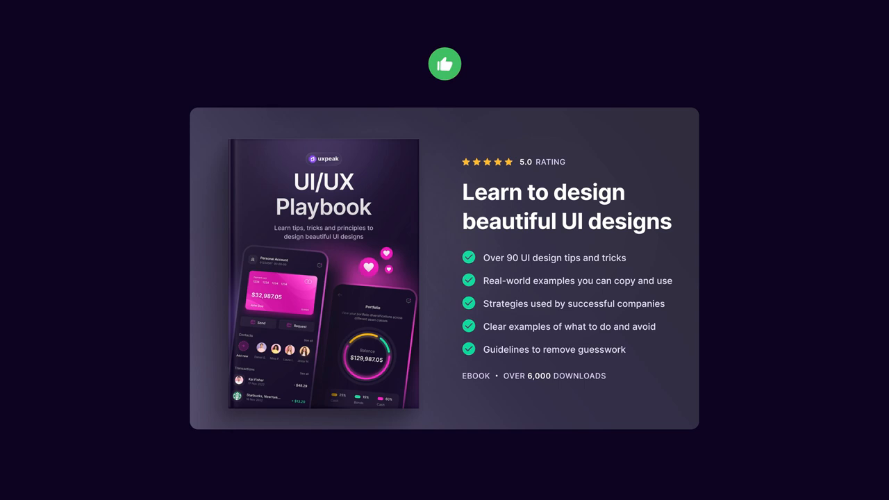
A real-life example includes two versions of the UI/UX Playbook cover:
- In one version, the Playbook appears against a bland, plain background.
- In another version, the Playbook’s key features are beautifully highlighted using matching tones, complementary colors, and descriptive elements.
Testing these iterations revealed a significant boost in conversion rates, from 22% to an astonishing 48%, simply by showcasing the product’s actual content pages. This transparency builds user excitement and confidence.
Remember, constant testing and optimizing ensures that your product presentation is always at its best.
Tip #5: Always strive for design excellence
Even with the perfect design principles in play, improvement never ends. Iteration is the hallmark of exceptional design. Whether through A/B testing, user feedback, or regular updates, there’s always room to fine-tune your creations.
For instance, after achieving conversion success with updated product imagery, further analysis and tweaks improved the outcomes even more. This commitment to excellence reflects on your entire brand and keeps your designs dynamic and user-focused.
Why the UI/UX playbook is your ultimate design guide

The UI/UX Playbook consistently proves its value for designers
The UI/UX Playbook is not just a guide—it’s a revolution in the way designers think, act, and create. Packed with all the principles mentioned above (and many more), it equips you with a deep understanding of design strategies that are both practical and transformative.
Whether you're just starting out or have years of experience, this Playbook promises to level up your skills, bridging the gap between where you are now and where you want to be. Plus, with an exclusive 60% discount code (VIP60), there’s no reason to wait!
A special surprise waits for you

Take advantage of the Playbook to transform your skills
By following the UI/UX tips mentioned above, you’ll create designs that are not only visually stunning but also functional and conversion-focused. The best part? The journey doesn’t end here—stay tuned for a part two with even more design gold! Get inspired, keep learning, and take the first step toward mastering your craft.
Don't forget to grab the UI/UX Playbook with the VIP60 discount code and start creating designs that your users will absolutely love.
Conclusion: Your journey to design mastery starts today
UI/UX design is all about creating experiences that users find intuitive, engaging, and delightful. Whether it’s optimizing shadows, managing visual hierarchy, or perfecting product presentation, the art lies in the details.
The UI/UX Playbook is your ticket to mastering these skills with ease. Thousands have already transformed their designs—what’s stopping you? Start today, and remember, design is not just what it looks like but how it feels to the user. Let’s make that experience unforgettable.
