Introduction to Auto Layout in Figma
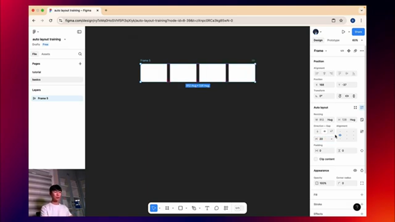
Figma is a powerful design tool that offers a wide range of features to help designers create responsive and user-friendly interfaces. One of the most powerful features in Figma is Auto Layout, which allows designers to create flexible and responsive designs with ease. In this article, we will explore the basics of Auto Layout in Figma and how to use it to create a responsive design for YouTube's layout.
What is Auto Layout?
Auto Layout is a feature in Figma that allows designers to create flexible and responsive designs by automatically adjusting the size and position of elements based on the screen size and other factors. With Auto Layout, designers can create designs that adapt to different screen sizes and devices, without having to manually adjust the layout for each device.
 Introduction to Auto Layout in Figma
Getting Started with Auto Layout
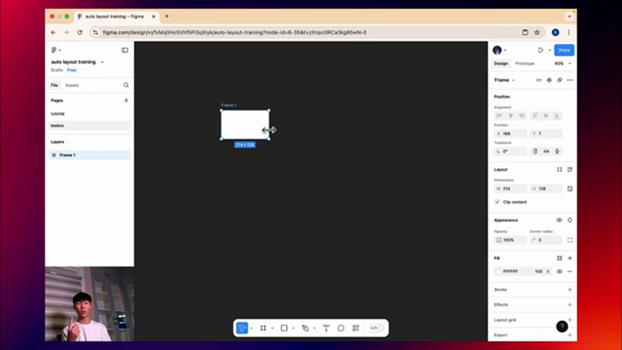
To get started with Auto Layout, designers can create a new frame in Figma and add elements to it. The elements can be text, images, or other shapes, and can be arranged in a variety of ways to create a responsive design. Designers can then use the Auto Layout feature to automatically adjust the size and position of the elements based on the screen size and other factors.
Using Auto Layout to Redesign YouTube's Layout
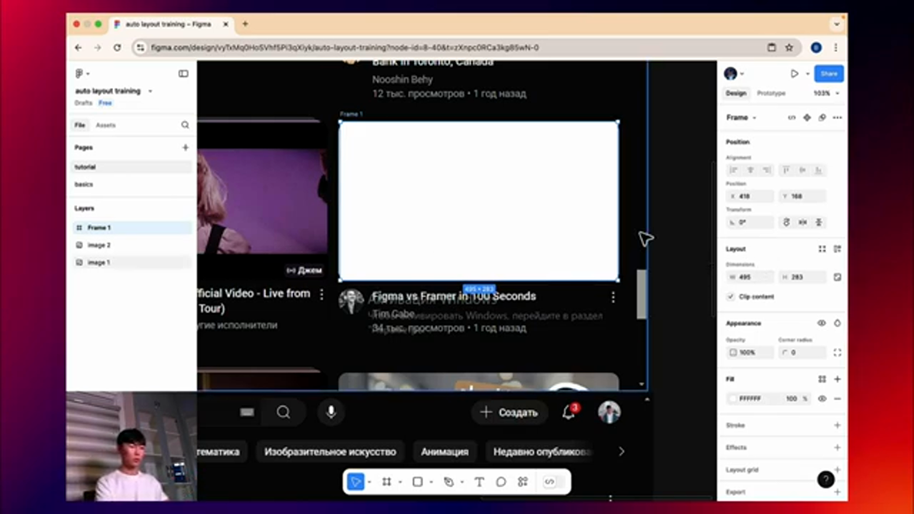
In this example, we will use Auto Layout to redesign YouTube's layout. We will start by creating a new frame in Figma and adding elements to it, such as the video title, channel name, and view count. We will then use the Auto Layout feature to automatically adjust the size and position of the elements based on the screen size and other factors.
 Redesigning YouTube's Layout with Auto Layout
Adding Corner Radius and Shadow to the Design
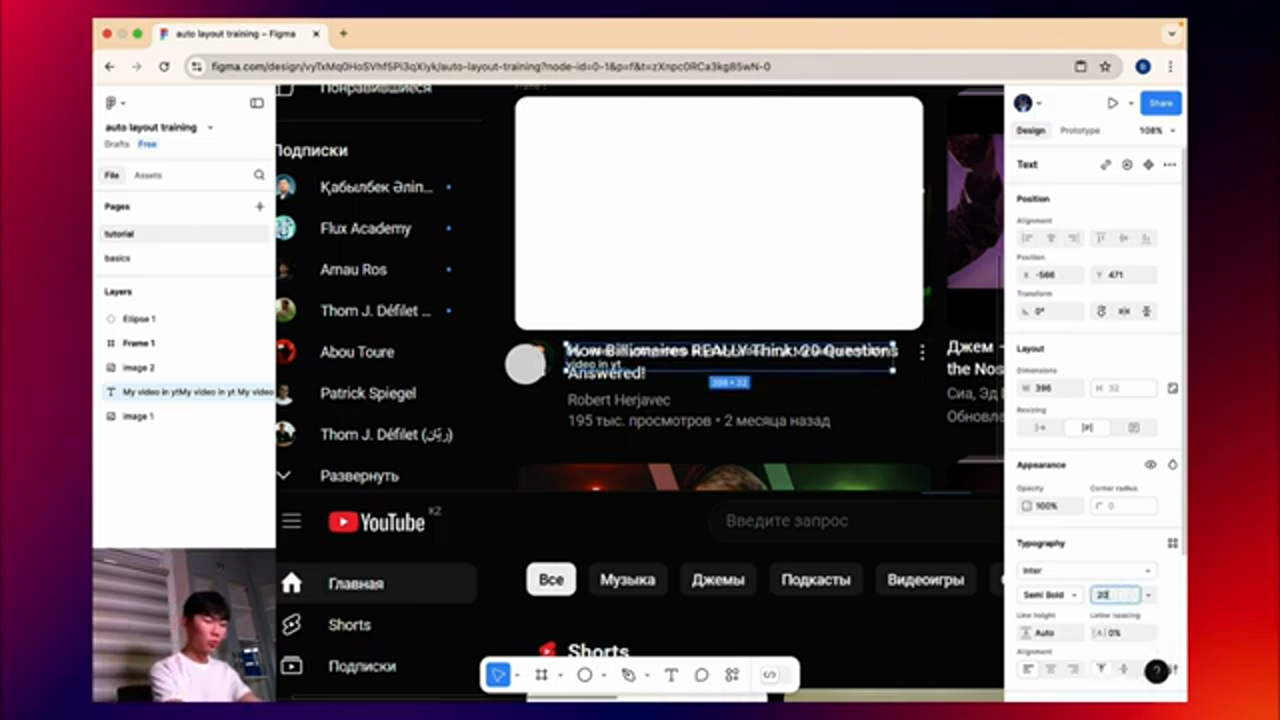
To make the design more visually appealing, we can add a corner radius and shadow to the elements. This can be done using the Corner Radius and Shadow features in Figma. We can adjust the corner radius and shadow to create a unique and stylish design.
 Adding Corner Radius and Shadow to the Design
Creating a Responsive Design with Auto Layout
To create a responsive design with Auto Layout, designers can use the feature to automatically adjust the size and position of the elements based on the screen size and other factors. This can be done by selecting the elements and using the Auto Layout feature to create a responsive design.
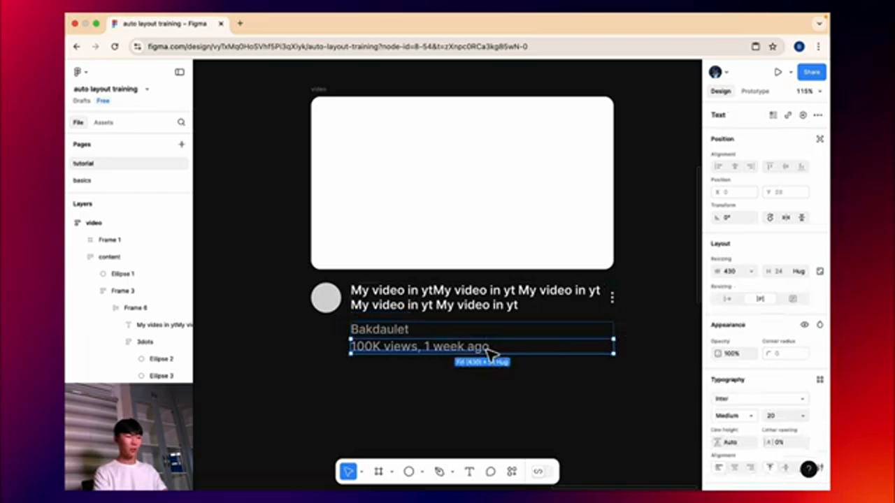 Creating a Responsive Design with Auto Layout
Conclusion
In conclusion, Auto Layout is a powerful feature in Figma that allows designers to create flexible and responsive designs with ease. By using Auto Layout, designers can create designs that adapt to different screen sizes and devices, without having to manually adjust the layout for each device. With the examples and tutorials provided in this article, designers can learn how to use Auto Layout to create responsive designs and take their design skills to the next level.

